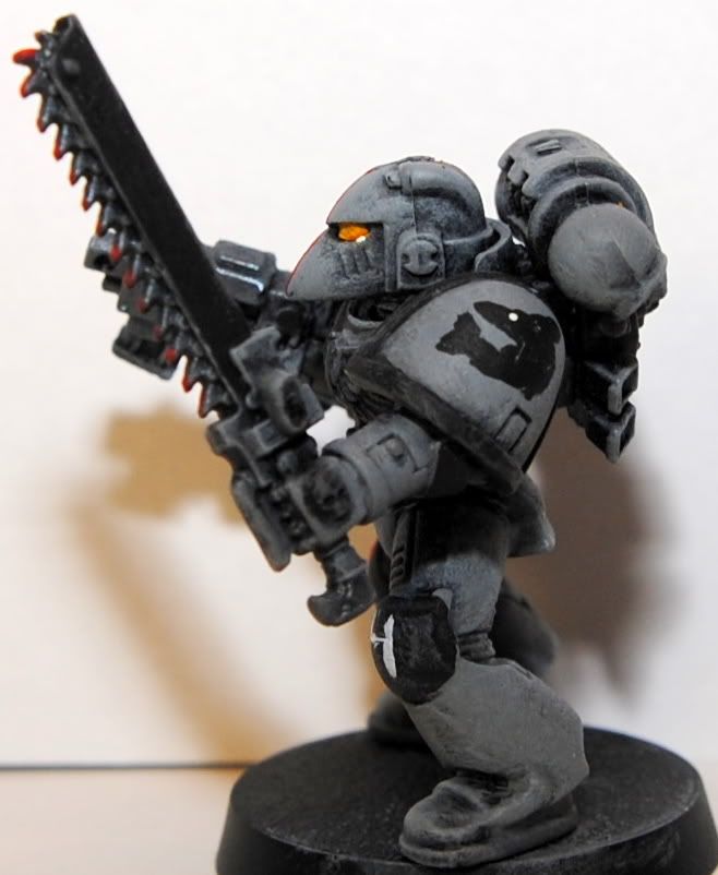
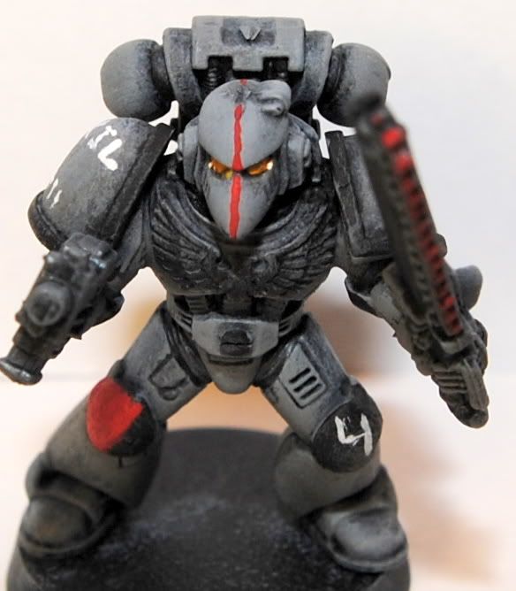
Some sloppy test models for armies I'm thinking about.
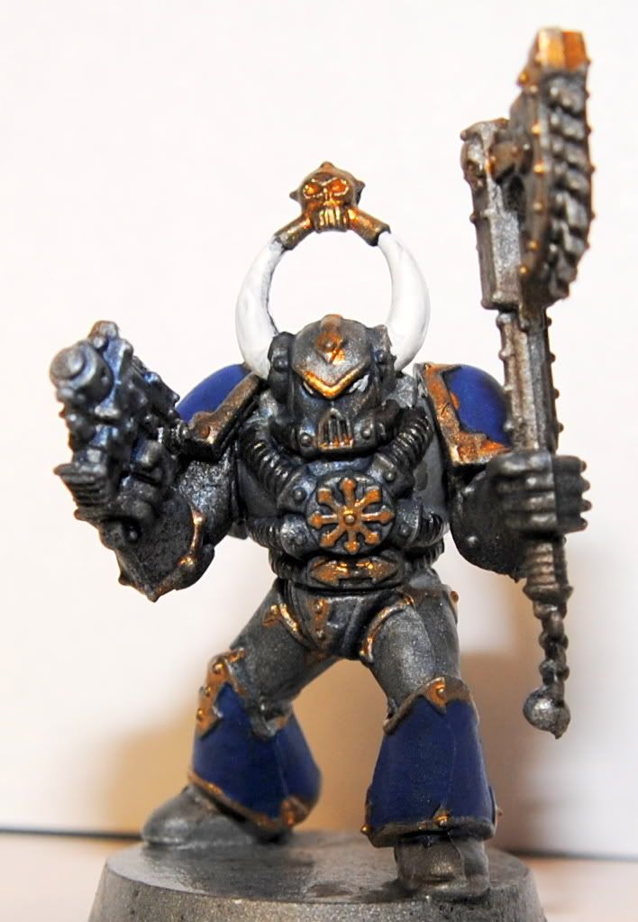
First up, potential scheme for the Tzeentchian Heralds of Oblivion. My current thought if I use this scheme and expand to other gods like Khorne or Nurgle is to just replace the blue with an appropriate color so the force will still look unified but easy to distinguish within the force.
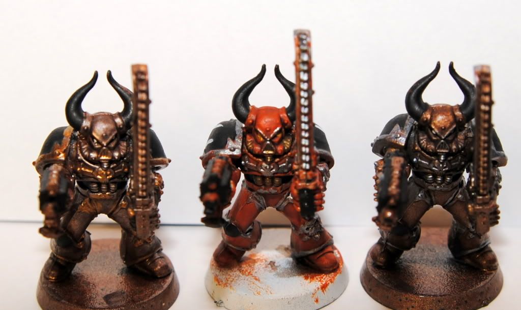
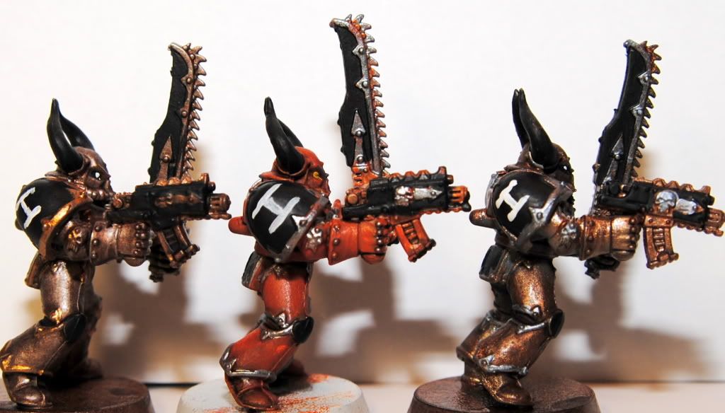
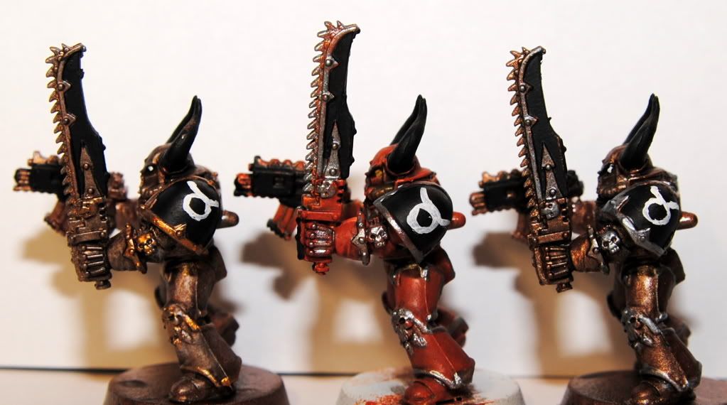
Next, some possible schemes for the Sons of Taurus:
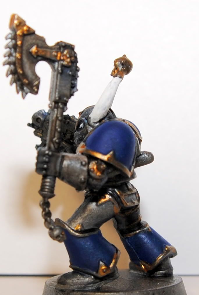
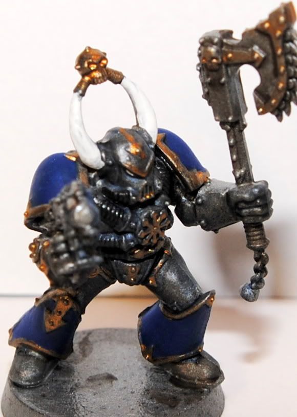
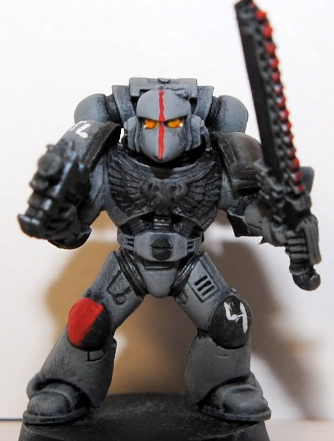
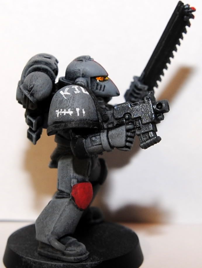
And lastly a test Space Shark:
Whatcha think? Do you have a favorite Sons of Taurus scheme?


First of all Rush=Awesome.
ReplyDeleteAnd my favourite Tauros guy is the red one :)
I prefer the one on the left.
ReplyDeleteI prefer the one from the left, or right, both look nice ;D
ReplyDeleteBut the one from the right it's more original.
I'm torn between the right hand side one or the red middle one. To be honest, they've all got things going for them which makes it a tough choice.
ReplyDeletePretty good spread so far.
ReplyDeleteBTW, the pics may not show it as well, but the middle SoT is actually more orange than red.
@The Antipope - Indeed they are.
I will be contrary and say I like the right side one the most. I'm not a big fan of gold, so there you are. Love the Land Sharks
ReplyDeleteMy favorite is the one on the right by a fairly wide margin. It looks to me the most original of the three and has a distinct bullish vibe. The orange middle guy is my runner up. All of them look cool though and the Space Shark is great. Good luck choosing!
ReplyDeleteThe middle taurus.
ReplyDeleteRight one for me too - the silver trim stands out way better. I'd even suggest extending the use of the silver onto the bolter (magazine, barrel).
ReplyDelete